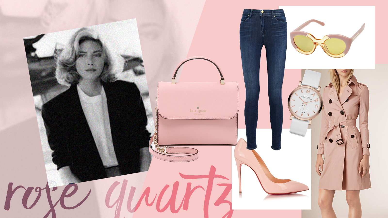
So you might be aware that this year Pantone decided not to have a colour of the year instead they decided that a blending of two colours would add a softer take on a “colour of the year”. The chosen swatches are Rose Quartz (a rose hue) and Serenity (a cooler tranquil blue). They have claimed that these colours “psychologically fulfill our yearning for reassurance and security” and “reflect connection and wellness as well as a soothing sense of order and peace”. For me personally, I didn’t quite get it. In past years the Pantone colour has definitely had an impact or a stronger grab of my aesthetic. When I first reviewed these colours I was underwhelmed. Maybe because I couldn’t place them in my everyday life – I’m not a light, pastel colour girl… tending more towards the darker, stronger tones. Give me black, navy, grey and white anyday.
So physical challenge set! Find an outfit that I would wear using these colours. First up we have Rose Quartz… probably the one that I struggled with the hardest as rose-pink really isn’t on my radar for a colour to wear at all! Ive teamed each outfit with a muse for inspiration… Links below to each piece. What do you think? Would you wear this colour palette?
Look 1
Look 2
Related Posts
2 Comments
Add comment Cancel reply
This site uses Akismet to reduce spam. Learn how your comment data is processed.


I love rose quartz! It’s such a great year-round color and I especially love it with grey and white! Those Louboutin’s have been on my wishlist for a while now!
Thanks Monica! Ive just put the finishing touches on the outfits inspired by the colour Serenity.. so stay tuned!. If you have Instagram, be sure to follow me on there as I generally post up new Blog posts on Instagram first. Thanks for stopping by and commenting 🙂